Difference between revisions of "User interface"
(→Responsive) |
(→Apps and mobile) |
||
| Line 32: | Line 32: | ||
| − | [[File:20151126 RouteXL small screen portrait.png|x375px | + | [[File:20151126 RouteXL small screen portrait.png|x375px]] |
| − | [[File:20151126 RouteXL small screen landscape.png|375px | + | [[File:20151126 RouteXL small screen landscape.png|375px]] |
Revision as of 14:19, 30 November 2015
1. The map where your addresses and the route will be displayed
2. Search box for typing addresses
3. Import button to add destinations in batch
4. Addresses button to show the list of the locations that were added
5. Demo button to show a short instructional video
6. Options button to change settings
7. Find route button to start the route calculation
8. Print button to print the route
9. Download button to download a route in various file formats
10. Share button to share routes with friends or colleagues
11. Reset button to clear all addresses and start over
12. Extra button to upgrade your account to the premium service
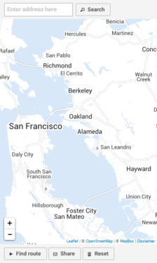
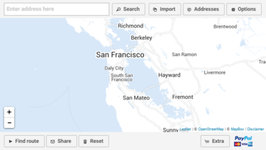
Apps and mobile
If you're working on a small sized screen, smartphone or tablet, some buttons may be hidden to fit the available space. The responsive design adjusts the user interface automatically to the device. If you're able to turn the screen 90 degrees from portrait to landscape, the interface will adjust and more buttons may appear:


